You built the flow. The logic works, the data saves, the validation fires. And yet the onboarding, the checkout, the setup wizard still feels off. A bit busy. A bit cheap. Like a default admin template someone forgot to finish. People hesitate on step two, and some of them just leave.
It is almost never the code. It is the feel. A form that looks unsure of itself makes the user unsure too, and an unsure user does not hand over their card details.
Why this skill exists
Most attempts to fix a rough form make it worse. You add a progress bar, then a card around each section, then some icons, a helper line, a badge, a touch of glow, and now it looks like a dashboard having a breakdown. More UI feels like more effort, so it feels like it should look more premium. It does the opposite.
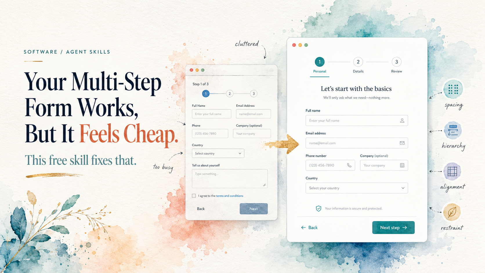
The actual secret is dull, and it is this: premium comes from spacing, hierarchy, alignment, consistent states, and restraint, not decoration. The best-looking forms are the ones where someone quietly removed things until only the clear path was left.
That judgment, knowing what to change and, harder, what to leave alone, is what premium-multi-step-form-design packages up. It reviews, redesigns, or builds multi-step forms (wizards, onboarding, checkout, setup, config) so they feel clear, calm, and production-ready, without tipping into busy or overdesigned.
How it actually works
It does not paste a generic template over your project. It works the way a good designer would.
It reads your project first. Before it touches anything, it looks for your design tokens, components, validation patterns, and breakpoints, then reuses your system instead of overriding it. That is the whole reason the result does not look templated.
It defaults to restraint. Its opening move is a minimal-intervention pass: change the few highest-impact things, leave the rest, and tell you what it left alone and why. A good run might touch only the stepper and the button hierarchy and nothing else.
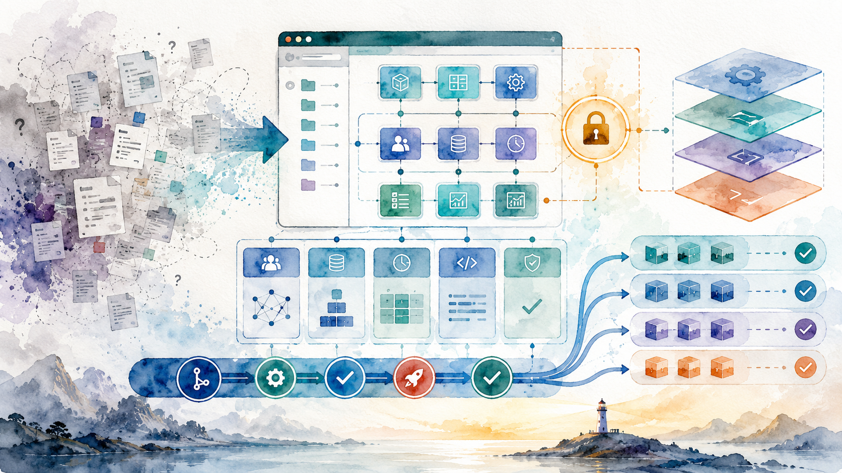
It works through seven areas by impact. Stepper clarity so the current step is unmistakable, action hierarchy so there is one clear primary button instead of five equal ones, a sticky action bar only when it earns its place, sensible sectioning, consistent controls, calm validation that appears near the field instead of shouting on page load, and subtle polish. It reads its own detailed notes for each area before writing code, so it is not improvising.
It keeps your app working. Your workflow, data model, and submit behaviour are preserved, no new dependencies are added, and changes stay localized and explained.
Point it at nothing and it will build a new form from a bundled, dependency-free starter instead, ready to rebrand to your own tokens. It is framework-agnostic, so React, Vue, Svelte, or plain HTML all work.

The visual language fits the pitch nicely: clear steps, calm spacing, and one obvious path forward instead of a form trying to shout from every corner at once.
The honest bit
It is not a magic wand for a broken flow. If step three asks for something the user cannot possibly have yet, no amount of good spacing saves it. This fixes how a form feels and reads, not a fundamentally wrong sequence. And because restraint is the point, do not expect a flashy before-and-after full of glow and gradients. The wins are quieter than that, which is exactly why they work.
Try it
If you have a wizard, a checkout, or an onboarding flow that works but does not feel finished, this is the fastest way to make it feel like someone actually cared. Point it at the form, let it inspect, and let it tell you the two or three changes that genuinely matter.
It is free. Grab it here: premium-multi-step-form-design. Then go and look at the form you have been quietly avoiding.